
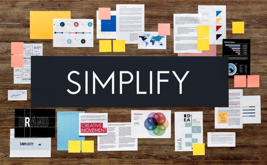
Design Principles for Visual Order
Hierarchy: The Spine of Visual Order
Scale communicates priority faster than words. A bold headline set significantly larger than supporting text creates immediate clarity. On a charity landing page we redesigned, simply enlarging the donation button and shrinking secondary links doubled conversions overnight.
Use weight, not just size, to guide attention. Bold a crucial phrase, not entire paragraphs. A mentor once said, “If everything shouts, nothing speaks.” Try limiting bold text to a single, decisive moment per section to preserve order.
Create a consistent spacing scale—small, medium, large—and apply it relentlessly. When margins, paddings, and line spacing follow predictable steps, readers intuitively understand relationships. Share your spacing ladder in the comments for feedback from our community.
Grid Systems: Order You Can Feel, Not See
Design with living content, not lorem ipsum. A modular grid supports variable text, images, and cards without breaking alignment. On a museum poster series, a 12-column grid let us mix bold dates and quiet body copy while preserving crisp order.

Whitespace: The Quiet Architect
Adding space around primary actions increases clarity more than another color or icon ever could. In user tests, participants clicked confidently when the primary button had generous padding and margin. Whitespace turns attention into intention by making the next step unmistakable.
Whitespace: The Quiet Architect
Even margins aren’t always optically balanced. Heavier elements often need extra space to feel equal. Compare left and right margins around bold images, then adjust until both sides feel calm. Trust your eyes, then validate with measuring tools.
Rhythm and Repetition: Consistency With Character
Repeat what helps, vary what matters. Section headers might always include a label, a divider, and a snippet, forming a predictable rhythm. When variation appears—say, a callout block—attention spikes for a good reason, not by accident.
Rhythm and Repetition: Consistency With Character
Icons should share stroke weight, corner radius, and perspective. In one app redesign, we unified a scattered icon set, and support tickets about “confusing buttons” dropped dramatically. Cohesive styles create calm expectations and make scanning faster and friendlier.
Rhythm and Repetition: Consistency With Character
A living component library turns repetition into reliability. Define states, spacing, and naming conventions. When teams reuse components instead of improvising, they preserve order at scale. Comment with a component you’ve standardized and the chaos it eliminated.
Contrast and Grouping: Make Relationships Obvious
Proximity and Similarity Create Meaning
Place related items close; style them similarly. Distanced or differently styled items feel unrelated. We once moved form labels closer to fields and matched their type styles—completion times improved immediately because the relationship finally looked obvious.
Figure–Ground Keeps the Message Above Noise
Ensure the main message sits clearly above background textures or images. Soften or blur busy photos behind text. When figure and ground separate cleanly, readers stop wrestling with noise and start absorbing what you actually want to say.
Continuity Guides Scanning
Use lines, arrows, and aligned edges to guide motion. A subtle divider that runs across cards can create a reading path. Continuity reduces friction by connecting related parts into a single, smooth journey for the eye.
Color and Accessibility: Order Through Perception
Assign color roles—primary, secondary, success, warning—then reuse them consistently. Designers on our team speak in tokens, not hex codes, which keeps systems coherent. Readers learn that blue means action, green means success, and the interface feels instantly predictable.