
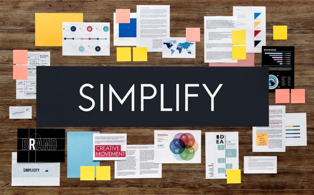
Grid Systems for Enhanced Visual Structure
From Swiss Style to Digital Clarity
The roots of grid thinking trace to Swiss Style, where Josef Müller-Brockmann championed order and clarity. Today, those principles translate beautifully to screens, guiding layout, spacing, and hierarchy without sacrificing personality. Share your favorite historical influences.
Reduced Cognitive Load, Increased Trust
Consistent alignment, predictable gutters, and clear hierarchy reduce scanning effort, leading to faster comprehension and higher confidence. Users feel the difference instantly, even if they cannot name it. Comment with a before-and-after story from your product.
Your First Step Today
Start by sketching a simple column grid and placing key components where users naturally look. Small structural decisions multiply their impact across pages. Post your sketch or wireframe and ask the community for feedback today.
Choosing a Grid That Fits Your Content

Articles, case studies, and landing pages often benefit from two to four columns with generous gutters and a comfortable line length. This keeps reading effortless and pacing natural. Share your go-to column counts and why they work.
Responsive, Fluid, and Content‑First Grids
Breakpoints With Purpose
Define breakpoints where content actually fails, not where devices happen to exist. Test copy wrapping, image ratios, and component density. Invite readers to scroll recordings of your pages and vote on the most comfortable breakpoint transitions.
Rhythm, Spacing, and Visual Hierarchy
Pick a modular scale that suits your brand voice—subtle for calm interfaces, bolder for expressive products. Map sizes to tokens, then apply consistently. Post your scale and ask the community which step intervals read best.
Rhythm, Spacing, and Visual Hierarchy
Align text baselines and component heights to a consistent step. This reduces micro-misalignments that tire the eye. Try measuring perceived reading ease with real users, then share results and what spacing increment changed everything.
Rhythm, Spacing, and Visual Hierarchy
Whitespace creates breathing room, clarifies relationships, and guides attention. Treat it like punctuation in a story. Invite readers to annotate your layout, highlighting where space improved comprehension or where density still feels overwhelming.

Accessibility Baked Into the Grid
Keep lines between forty-five and seventy-five characters, maintain strong color contrast, and use spacing that supports scanning. Ask a screen-reader user to navigate your page, then report back with what felt clear or confusing.
Accessibility Baked Into the Grid
Grids influence tappable regions and safe spacing. Ensure targets are comfortably large with adequate vertical rhythm, especially on mobile. Share your minimum spacing standards and invite peers to test them on different devices and hands.
Data, Dashboards, and Comparability
Group metrics into cards anchored to a steady grid. Keep headings, values, and actions consistently placed so scanning becomes automatic. Share a dashboard mockup and invite readers to spot alignment wins and weak points.

Low-Fidelity Grids First
Begin with pencil sketches or gray-box wireframes to validate structure before color and imagery distract. This uncovers layout issues early. Share a quick wireframe today and ask the community where rhythm or hierarchy could improve.
Design Tokens and Documentation
Codify columns, gutters, spacing steps, and type scales as tokens. Document usage and anti-patterns with clear examples. Link your repository or style guide and invite contributors to suggest refinements for edge cases.
Measure, Iterate, Celebrate
Track reading time, task completion, and error rates before and after grid changes. Iterate deliberately, then share your wins and failures. Subscribe for upcoming templates, checklists, and real-world teardown sessions you can apply immediately.
